Steady
An app for people who are afraid of flying. It reads the flight from the phone's own sensors and tells you what is happening in words, while it is happening.
An evening project, and the one I enjoy most: taking an idea far enough to see whether it works as a real, functional thing rather than a deck. This one is still R&D — the design exists, the app does not.
- Stage
- R&D, no code yet
- Made in
- Claude · Claude Design
- Team
- solo, part-time
- Platform
- iPhone · Apple Watch (v2)
- Network
- none in flight
- Done so far
- mark, sensors, screens
- Next
- undecided
01 — THE PREMISE
The phone already knows what the plane is doing.
Fear of flying is largely a fear of not knowing what a noise or a movement means. The information that would settle it is in the cabin already: pressure tells you the phase of flight, vertical acceleration tells you how rough the ride actually is. Both are readable in airplane mode, with no signal and no subscription.
So the product is a narrator rather than a tracker. Every reading reaches the passenger twice: once as a sentence during the flight, once as evidence afterwards.
Words lead. The number is small, and it reassures only because it is small.
02 — WHAT IT READS
Three inputs, one output, all on device.03 — SCREENS
Five renders. Light before the flight, dark during it.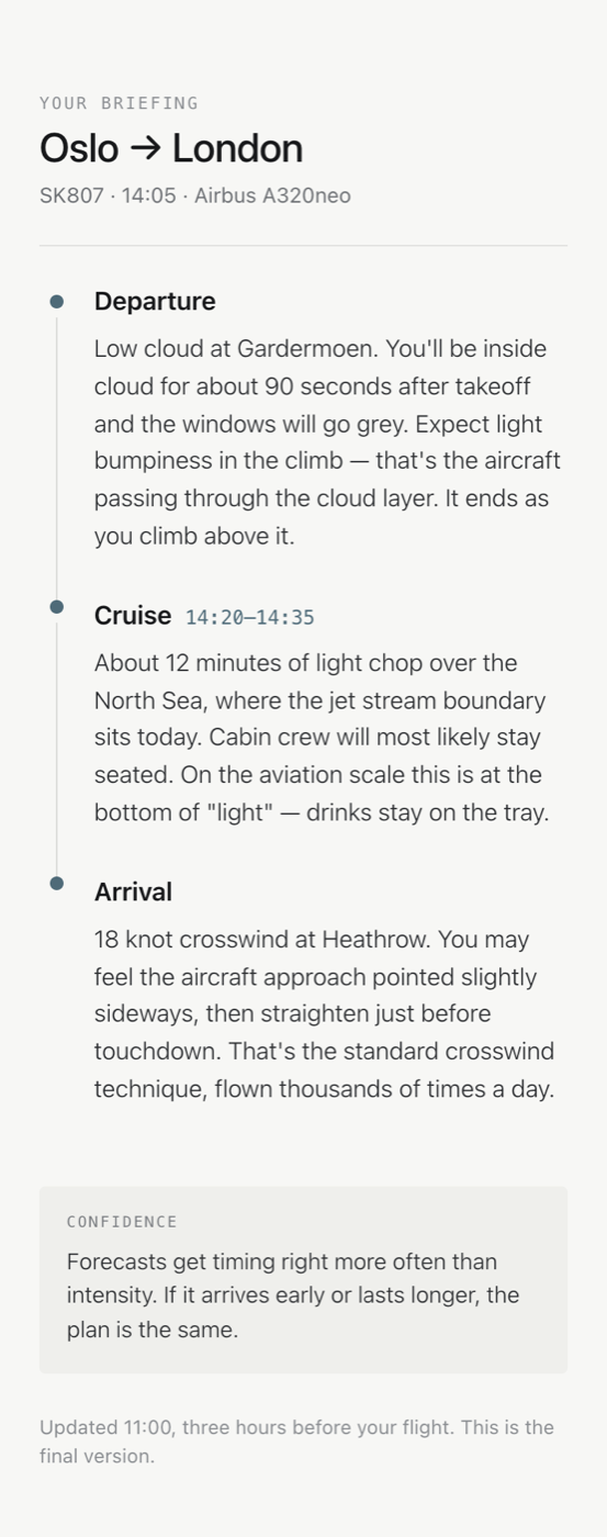
The briefing
Three moments, each answering what you will feel and why. The only numbers on the screen are a time window and a wind speed; everything else is a sentence. It ends by dating itself and stating that this is the final version.
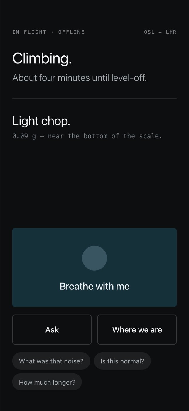
In flight, offline
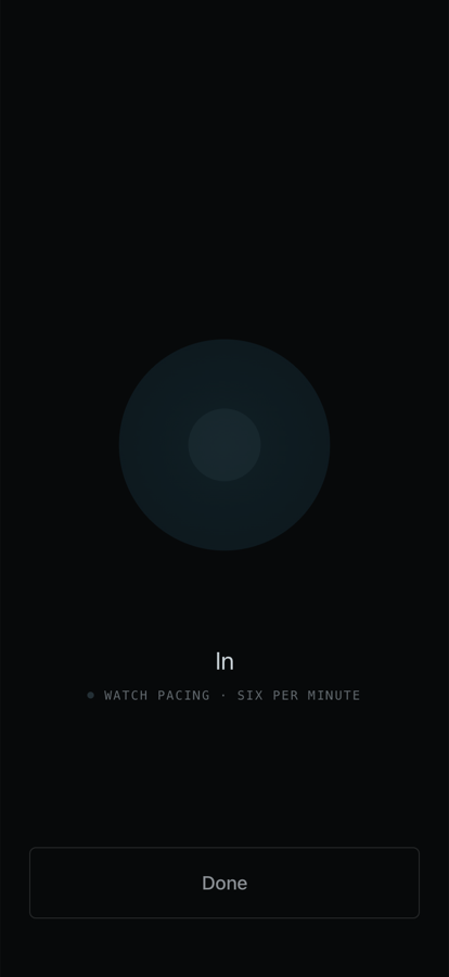
Phase and ride condition as two short statements, with the g figure set small in mono underneath. Below them the three things a frightened passenger might want: breathe, ask, or see where the aircraft is.
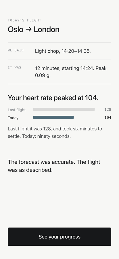
04 — DESIGN DECISIONS
The four that shape everything else.The briefing locks
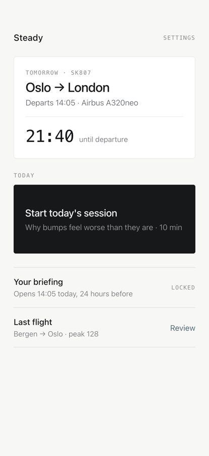
The briefing opens the day before, reaches its final version three hours out, then closes: “This is the final version.” Checking repeatedly raises anxiety rather than settling it — the relief fades and the urge comes back stronger. The product refuses to be checked.
Plain language, per phase
Departure, cruise, arrival, each described as what you will feel and why: ninety seconds inside cloud, twelve minutes of light chop where the jet stream boundary sits, a crosswind approach flown thousands of times a day.
Honest about forecasts
The briefing states its own confidence: timing is more reliable than intensity, and if it arrives early or lasts longer the plan does not change. Overpromising once costs the app all of its credibility.
A mark reduced to two shapes
The window was reduced six times, losing the inner frame, the sky tint, the ground and finally the stroke. It bottoms out at two elements — an aperture crossed by one line — and the last step proves the floor: without the line it is a rounded rectangle and the idea is gone. Which of the two-element variants wins is still open.
05 — SHAPE OF IT
Design work, counted.- SENSORS
- 3two required, one optional
- NETWORK CALLS IN FLIGHT
- 0everything on device
- FLIGHT PHASES NAMED
- 5taxi to approach
- BRIEFINGS PER FLIGHT
- 1then it locks
06 — STILL OPEN
What R&D is actually for.
Whether the accelerometer reading survives real cabins — a seatmate shifting, a phone on a tray table, a tray table being knocked. The filtering is designed for it and untested against it.
Whether a frightened passenger reads sentences at all, or whether the elevated state should say almost nothing. The current design assumes reading; that assumption is the first thing a prototype would test.
Whether the locked briefing is a kindness or an irritation. It is the most opinionated decision in the product and the easiest to get wrong.